How to Choose the Right Lighting Color Temperature
Lighting color temperature shapes how a space feels, functions, and even affects your mood. The right tone of light can make a living room feel cozy, a kitchen look vibrant, or a home office boost focus. Whether you’re renovating, setting up smart bulbs, or upgrading old fixtures, understanding how color temperature works helps you build an atmosphere that supports your lifestyle and comfort.
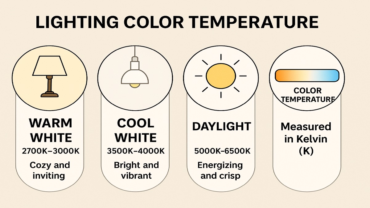
Color temperature is measured in Kelvins (K) and tells us how “warm” or “cool” the light appears. Warm tones (2700K–3000K) give off a golden glow that feels inviting, while cooler tones (4000K–6500K) mimic daylight and help you stay alert. Once you know how to balance these temperatures across your home, lighting becomes more than brightness—it becomes design and wellbeing combined.
What Is Lighting Color Temperature?
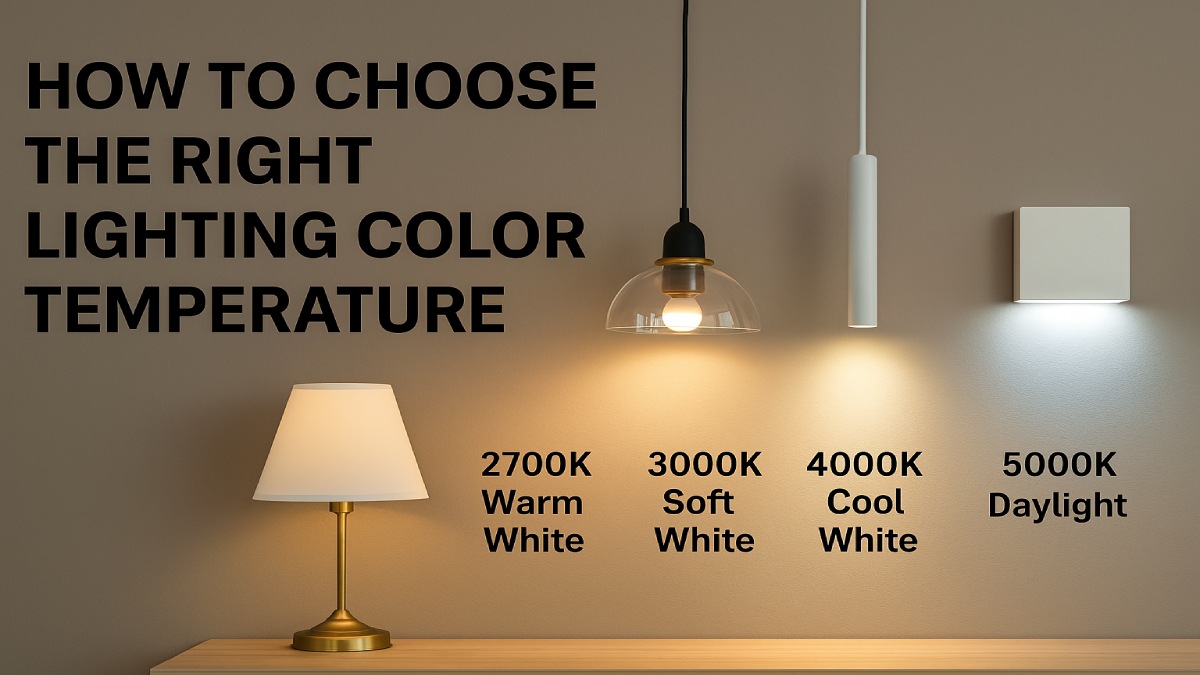
Every light source emits a color tone. Measured on the Kelvin scale, lower values create warm, amber glows similar to candlelight, while higher values appear white or blue like midday sunshine. The range typically used in homes runs from 2000K to 6500K, offering flexibility for different moods and spaces.
The Kelvin Scale Explained
Think of the Kelvin scale as a spectrum of light appearance:
- 2000K–2700K: Soft, warm glow ideal for bedrooms and living rooms.
- 3000K–3500K: Neutral white that suits dining and family areas.
- 4000K–5000K: Cool, bright white—perfect for offices or task zones.
- 5000K–6500K: Daylight-like tone for garages, studios, and outdoor lighting.
The temperature you pick determines the emotion of a room. A 2700K bulb relaxes the eyes after sunset, while a 5000K light energizes you on a cloudy morning.
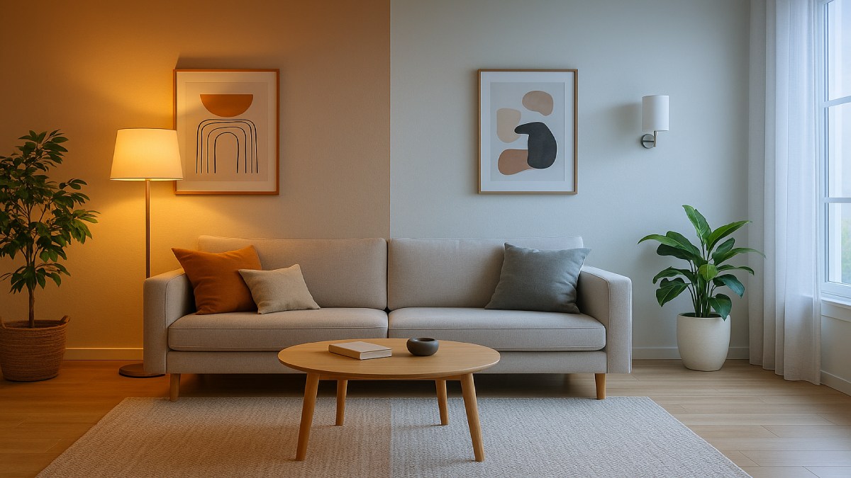
Warm vs. Cool Light — The Emotional Effect
Light has a psychological influence. Warm tones make people feel relaxed, nostalgic, and at ease, so they work best for lounging and unwinding. Cool whites enhance alertness and concentration, which is why workplaces, kitchens, and home offices rely on them. Your wall colors also interact with light temperature—a warm light softens white walls, while cool light intensifies blues or grays.
The Science Behind Color Temperature and Mood
How Light Impacts the Human Brain
Modern studies reveal that light exposure controls much more than visibility—it influences energy, focus, and sleep cycles. Our eyes contain specialized cells called intrinsically photosensitive retinal ganglion cells (ipRGCs) that react strongly to blue-enriched light. These cells help regulate the body’s circadian rhythm, which manages alertness during the day and rest at night.
Cooler light temperatures (around 5000K) signal “daytime” to the brain, promoting productivity. In contrast, warmer tones (below 3000K) support relaxation by reducing blue wavelengths that delay melatonin production. By adjusting color temperature throughout the day, you can support a natural rhythm that improves both energy and sleep quality.
The Role of Melanopic EDI and Spectrum
Experts now measure light’s biological impact using melanopic equivalent daylight illuminance (EDI) instead of just Kelvin values. This approach accounts for the light spectrum that affects your circadian rhythm. While CCT provides visual comfort, melanopic EDI ensures biological balance. High daytime exposure and low evening exposure maintain natural energy cycles.
In simple terms, use bright, cool light when you need to focus—and soft, warm light when it’s time to unwind.
Recommended Color Temperatures by Room
Different rooms require different atmospheres. Here’s how to assign lighting temperatures throughout your home for comfort and function.
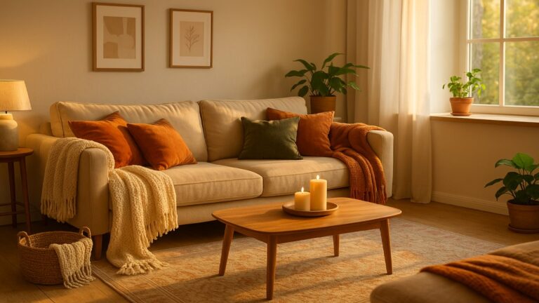
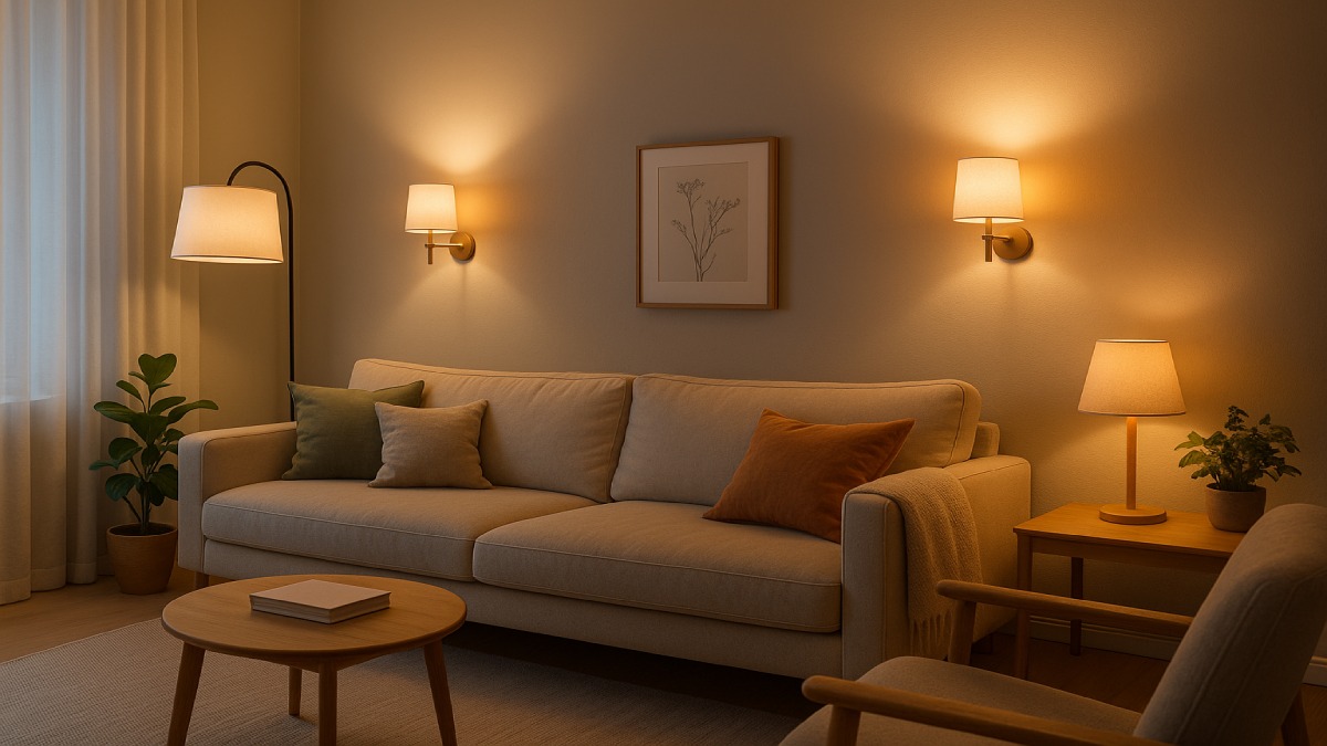
Living Room and Bedrooms — Warm and Relaxing (2700K–3000K)
Living rooms and bedrooms should feel cozy and intimate. Opt for bulbs in the 2700K to 3000K range. They cast a gentle glow that complements soft furnishings and warm wall tones. Add dimmers or smart bulbs to switch between “movie night” and “reading mode” without harsh contrast. Lamps, sconces, and soft LED strips work wonders here.
Kitchen and Bathroom — Bright and Balanced (3500K–4100K)
Clarity matters in these spaces. Balanced white light around 4000K helps you see food colors accurately and apply makeup under natural-looking tones. Combine overhead fixtures with under-cabinet LEDs or vanity lights for depth. Look for high color rendering (CRI 90+) bulbs to ensure whites, greens, and reds look true to life.
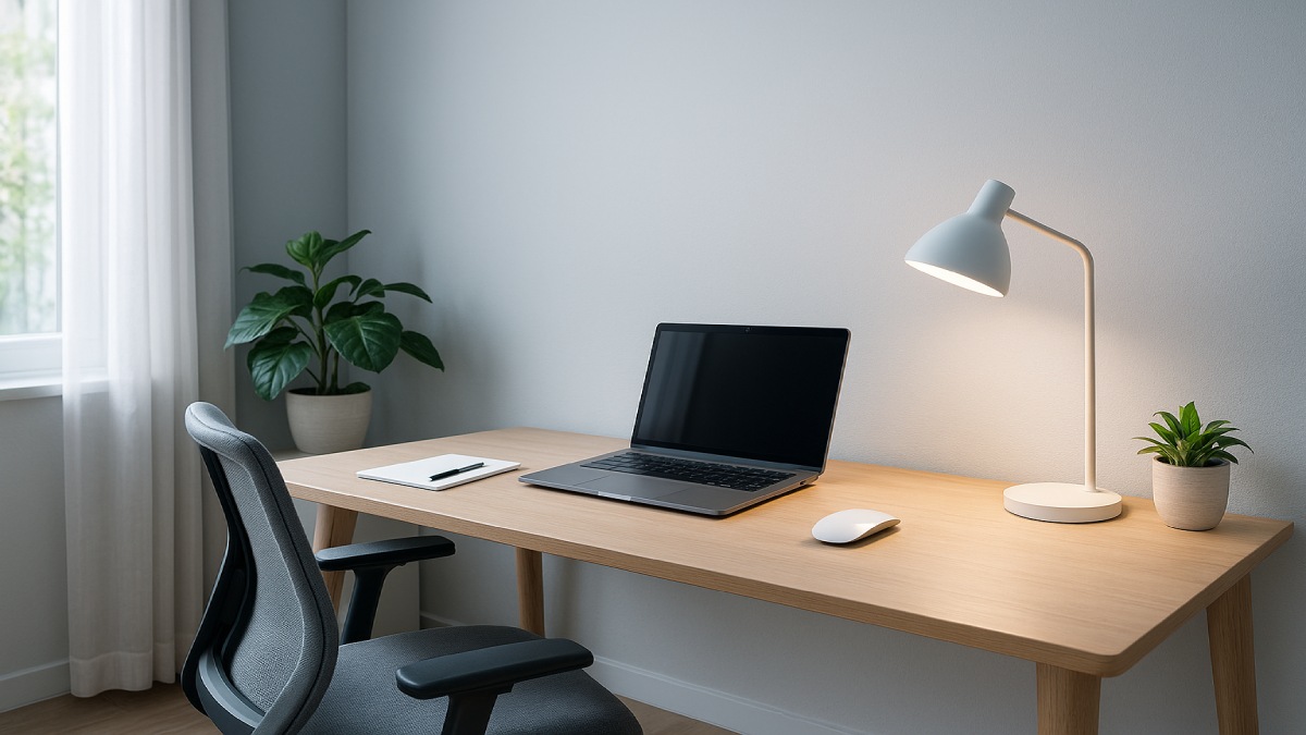
Home Office — Crisp and Focused (4000K–5000K)
In a workspace, cooler white light enhances alertness and reduces fatigue. A 4500K tone mimics daylight and keeps your mind active. Layer your lighting: diffused ambient light for general brightness and task lights for reading or keyboard work. Avoid overly blue 6500K tones—they can feel sterile or cause eye strain.
Outdoor and Utility Areas — Functional and Secure (5000K–6500K)
Outdoor lighting benefits from higher color temperatures because cooler whites provide greater visibility and security. Garage, pathway, and porch lights around 5000K mimic daylight, helping you see clearly. Pair motion-sensing or dusk-to-dawn fixtures with these tones to save energy and increase convenience.
CRI, TM-30, and Color Temperature Compared
Why Color Rendering Index (CRI) Matters
CRI measures how accurately a light source displays colors compared to sunlight. A CRI above 90 produces vibrant, natural tones—essential in kitchens, bathrooms, and art spaces. Low-CRI bulbs can make skin tones look dull or objects appear faded, even if the color temperature is correct.
TM-30 — The Modern Standard
TM-30, a newer lighting metric, offers two key measures: fidelity (Rf) and gamut (Rg). Rf describes color accuracy, while Rg indicates color richness or saturation. Together, they give designers more precise control over light quality. For residential use, aim for Rf ≥ 90 and Rg near 100 for balanced realism.
Balancing CRI and CCT
High color temperature doesn’t always mean better visibility. Prioritize CRI and TM-30 values before selecting CCT. A 3500K light with excellent color rendering can feel far more comfortable than a harsh 5000K bulb with poor fidelity.
How to Match Lighting with Daily Routines
Light should adapt to your activities and natural rhythm. Smart lighting and tunable white bulbs make this easy, letting you shift tones throughout the day.
Morning to Noon — Cool for Energy
Start the day with 4000K–5000K lighting that simulates daylight and jumpstarts alertness. Use it in your kitchen, home gym, or office to stay productive during working hours. Exposure to cool light helps align your internal clock with the day.
Afternoon to Evening — Warm for Relaxation
As daylight fades, lower both intensity and color temperature to around 2700K–3000K. This transition helps your body prepare for rest. Dim your living room lamps or switch smart bulbs to “evening mode” to create calm without total darkness.
Smart Circadian Lighting Systems
Smart lighting ecosystems—like Philips Hue, Govee, or Nanoleaf—automatically shift tones based on the time of day. They maintain your circadian rhythm while adding style through app control or voice commands. Even budget options now include adjustable scenes for focus, reading, and relaxation.
Practical Tips for Choosing the Right Bulbs
Check More Than Just Color Temperature
Look beyond the Kelvin rating when shopping. Consider lumens for brightness, CRI or TM-30 for color quality, and wattage for efficiency. LEDs with dimmable or smart features offer flexibility. For most rooms, 800–1600 lumens per bulb delivers balanced brightness without glare.
Match Fixtures with Purpose
Each layer of light has a job. Ambient lighting sets the mood, task lighting focuses on specific areas, and accent lighting highlights design details. Mixing temperatures across layers can create visual chaos, so maintain consistency within a single room.
Test Before You Commit
Every home reflects light differently due to wall colors, flooring, and window placement. Try one or two bulbs before replacing all fixtures. Many smartphone apps now include color temperature meters—use them to compare how each bulb looks at different times of day.
Common Mistakes to Avoid
Mixing Inconsistent Color Temperatures
Installing warm and cool bulbs in the same area creates visual tension. Always stick to one tone range within a space or use tunable bulbs for smooth transitions.
Ignoring CRI or Glare Control
Cheap LEDs often have poor diffusion or low color rendering, leading to eyestrain or distorted hues. Choose high-quality bulbs with diffusers or frosted covers to reduce harsh shadows.
Forgetting Dimmers and Scene Control
Dimmers allow flexibility for mood changes, from bright study sessions to quiet evenings. Smart controls go a step further, letting you program “Focus,” “Relax,” or “Dinner” presets that shift both brightness and color tone.
Frequently Asked Questions
What color temperature is closest to natural daylight?
Daylight sits around 5000K–6500K. This cool white tone is best for task areas or rooms requiring clarity, like studios and offices.
Is 4000K too bright for a living room?
4000K can feel too crisp for relaxation zones. Stick to 2700K–3000K for softer ambience, and reserve 4000K for multifunctional spaces like kitchens or home offices.
Do smart bulbs improve sleep and productivity?
Smart bulbs help maintain healthy circadian rhythms by adjusting light tone and intensity automatically. Warmer evening light supports melatonin release, while cooler morning tones improve focus.
Which light is best for makeup or photography?
Use 4000K–5000K lighting with CRI 90+ for accurate skin tone visibility. Avoid overly warm or blue lights that distort color.
Final Takeaway
Color temperature does more than define brightness—it defines experience. From a relaxing bedroom to an energizing workspace, choosing the right tone helps balance design, comfort, and health. Start by matching light to room purpose: warm for relaxation, neutral for shared spaces, and cool for productivity.
For most homes, blending 2700K–5000K lighting through dimmers or smart systems provides the best of both worlds. The goal is not to flood every corner with light but to layer it thoughtfully—creating depth, mood, and efficiency that truly elevate your living environment.